


Era una tranquila mañana de marzo cuando un inesperado correo electrónico interrumpió nuestra rutina. El asunto rezaba así: “URGENTE”.” Venía de Tom, nuestro socio a largo plazo en México, un cliente con el que habíamos trabajado durante años sin ningún problema importante.
Al abrir el mensaje, el tono era inequívocamente tenso.
Tom transmitió una queja de su cliente final: una marca europea de cosméticos de gama alta. Su veredicto fue duro:
“El color parece barato. Completamente inaceptable”.”
La situación era grave.
100.000 bolsas con boquilla y rollos de película eran rechazados debido a la desviación del color. El cliente exigió una reembolso completo.
Para Tom, no se trataba solo de la calidad del producto, sino de su reputación y su contrato. Para nosotros, como Bolsa de caño Fabricantes, Fue un desafío directo a nuestra credibilidad y a nuestro sistema de control de calidad.
La investigación: Cuando el “código de color correcto” sale mal
Nuestra primera reacción fue de incredulidad.
Cada paso se había seguido con precisión:
- Se facilitaron los códigos de color Pantone
- Aprobadas las pruebas digitales
- Se confirmaron las pruebas físicas en papel antes de la producción
¿En qué se equivocó?
Inmediatamente revisamos todos los registros de comunicación y los archivos de producción. La respuesta estaba clara:
La verdad técnica tras el desajuste cromático
RGB vs. CMYK - Una diferencia fundamental
El cliente aprobó el diseño en una pantalla Apple utilizando Modo de color RGB, incluso con HDR activado. Aunque visualmente es impresionante, este entorno de visualización mejora significativamente el brillo y la saturación.
Sin embargo, impresión en huecograbado opera en un sistema completamente diferente-CMYK.
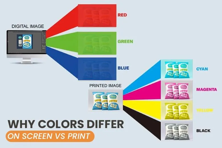
Este desajuste por sí solo puede dar lugar a diferencias visuales significativas.
Reproducción multimedia en color
El color se comporta de forma diferente según el soporte:
- Las pantallas digitales emiten luz
- El papel refleja la luz
- Los films de envasado flexibles (como PET, BOPP, materiales laminados) introducen efectos de transparencia, brillo y estratificación
Incluso con el mismo código de color, el aspecto final puede variar mucho.
Conclusión:
No se trataba de un error de producción, sino del clásico caso de interpretación errónea de los colores en Gestión del color en huecograbado.
La solución: Transparencia antes que defensa
En lugar de discutir, optamos por la claridad.
Organizamos un reunión tripartita por vídeo con Tom y el cliente final.
Al principio, el ambiente era tenso. La clienta se mostraba firme en su descontento, mientras que Tom estaba atrapado entre dos aguas.
Mantuvimos la calma y la profesionalidad.
Demostración en directo con datos
Durante la llamada, mostramos:
- La pantalla de Apple muestra los colores RGB
- Cartas de colores Pantone
- Pruebas en papel aprobadas
- Bolsas reales impresas
- Un directo prueba con colorímetro
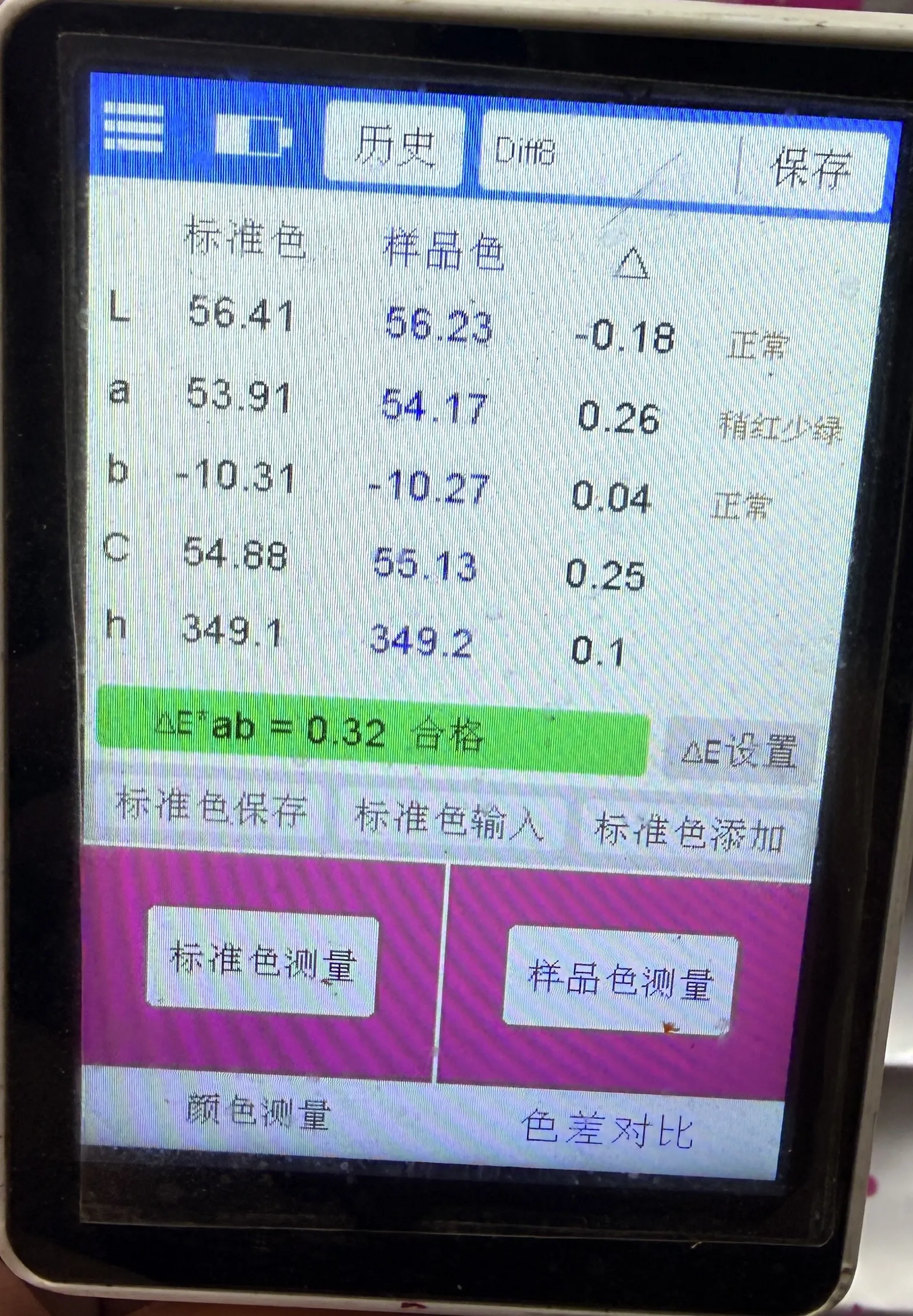
El resultado:
Delta E < 0,3 - una coincidencia casi perfecta dentro de la tolerancia de la industria.
El cliente hizo una pausa. El tono cambió.
Una propuesta práctica y beneficiosa para todos
Propusimos una solución en dos partes:
1. Plan de transición
- Ofrezca el lote actual en Precio 70%
- Ayudar al cliente a evitar la interrupción de la cadena de suministro
2. Plan de optimización
- Utilice Las cartas Pantone como única norma de color
- Enviar muestras físicas basadas en materiales antes de la producción
- Alinear las expectativas de todas las partes
Esta combinación de datos + responsabilidad + flexibilidad cambió la conversación.
El cliente reconoció la complejidad técnica y admitió no estar familiarizado con las limitaciones de la impresión en huecograbado.
La tensión se convirtió en cooperación.
4. La ejecución: Un sprint de dos semanas hacia la recuperación
La verdadera prueba comenzó después de la reunión.
Reanudamos la producción con una optimización total:
- Nuevos cilindros de huecograbado (planchas de impresión)
- Formulación de tinta personalizada
- Calibración continua del color
Y lo que es más importante, hemos introducido transparencia en tiempo real:
- Sesiones de vídeo en directo programadas durante la impresión
- Permitió al cliente revisar y ajustar los colores sobre el terreno
Este nivel de apertura forma parte de nuestra Soluciones de envasado flexible a medida enfoque.
Dos semanas más tarde, el segundo lote llegó a México.
Entonces llegó el correo electrónico que estábamos esperando:
“Aprobado”.”
El resultado: Confianza más allá de la crisis
La crisis no sólo se resolvió, sino que transformó la relación.
- Tom consiguió mantener su contrato
- El cliente final ganó confianza en nuestro proceso
- Reforzamos nuestro papel de socio fiable en la fabricación
Más tarde, Tom nos dijo:
“Ese asunto del color fue doloroso, pero me hizo confiar aún más en ti.
No todo el mundo gestiona los problemas con ese nivel de profesionalidad y transparencia”.”
Para llevar: El color desaparece, la confianza perdura
En el mundo de los envases flexibles, el color nunca es sólo color.
Todo proyecto implica variables:
- Materiales
- Métodos de impresión
- Percepción medioambiental
Incluso los sistemas más precisos pueden enfrentarse a retos inesperados.
Pero lo que realmente define a un fabricante no es evitar los problemas, sino cómo responden.
En Zhongjia Packaging, creemos:
Profesionalidad + Transparencia = Confianza a largo plazo
Como Bolsa de caño Fabricantes, Embalaje Zhongjia de ofrecer no sólo productos de alta calidad, sino también comunicación clara, conocimientos técnicos y soluciones fiables.
Porque al final, lo que dura más que el color es la confianza.
