


It was a quiet morning in March when an unexpected email disrupted our routine. The subject line read: “URGENT.” It came from Tom, our long-term partner in Mexico—a client we had worked with for years without a single major issue.
As I opened the message, the tone was unmistakably tense.
Tom relayed a complaint from his end customer—a European high-end cosmetics brand. Their verdict was harsh:
“The color looks cheap. Completely unacceptable.”
The situation was serious.
100,000 spout pouches and roll films were being rejected due to color deviation. The client demanded a full refund.
For Tom, this wasn’t just about product quality—it was about his reputation and contract. For us, as a Spout Pouch Manufacturer, it was a direct challenge to our credibility and quality control system.
The Investigation: When the “Right Color Code” Goes Wrong
Our first reaction was disbelief.
Every step had been followed precisely:
- Pantone color codes were provided
- Digital proofs were approved
- Physical paper proofs were confirmed before production
So where did it go wrong?
We immediately reviewed all communication records and production files. The answer became clear:
The Technical Truth Behind the Color Mismatch
RGB vs. CMYK — A Fundamental Difference
The client approved the design on an Apple display using RGB color mode, even with HDR enabled. While visually stunning, this display environment significantly enhances brightness and saturation.
However, gravure printing operates in a completely different system—CMYK.
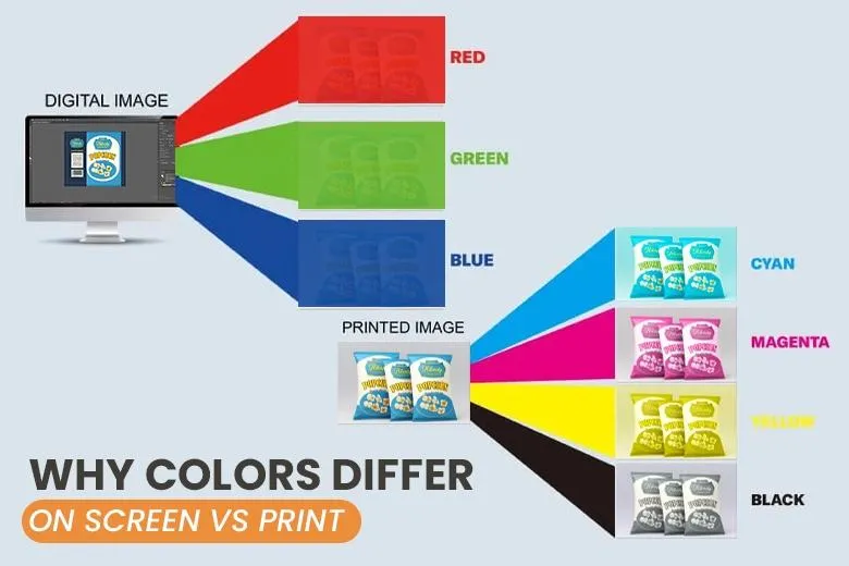
This mismatch alone can lead to significant visual differences.
Cross-Media Color Reproduction
Color behaves differently across mediums:
- Digital screens emit light
- Paper reflects light
- Flexible packaging films (like PET, BOPP, laminated materials) introduce transparency, gloss, and layering effects
Even with the same color code, the final appearance can vary greatly.
Conclusion:
This was not a production error—it was a classic case of cross-media color misinterpretation in Gravure Printing Color Management.
The Solution: Transparency Over Defense
Instead of arguing, we chose clarity.
We organized a three-party video meeting with Tom and the end client.
At the beginning, the atmosphere was tense. The client was firm in her dissatisfaction, while Tom was caught in between.
We stayed calm and professional.
Live Demonstration with Data
During the call, we showed:
- The Apple screen displaying RGB colors
- Pantone color cards
- Approved paper proofs
- Actual printed pouches
- A live colorimeter test
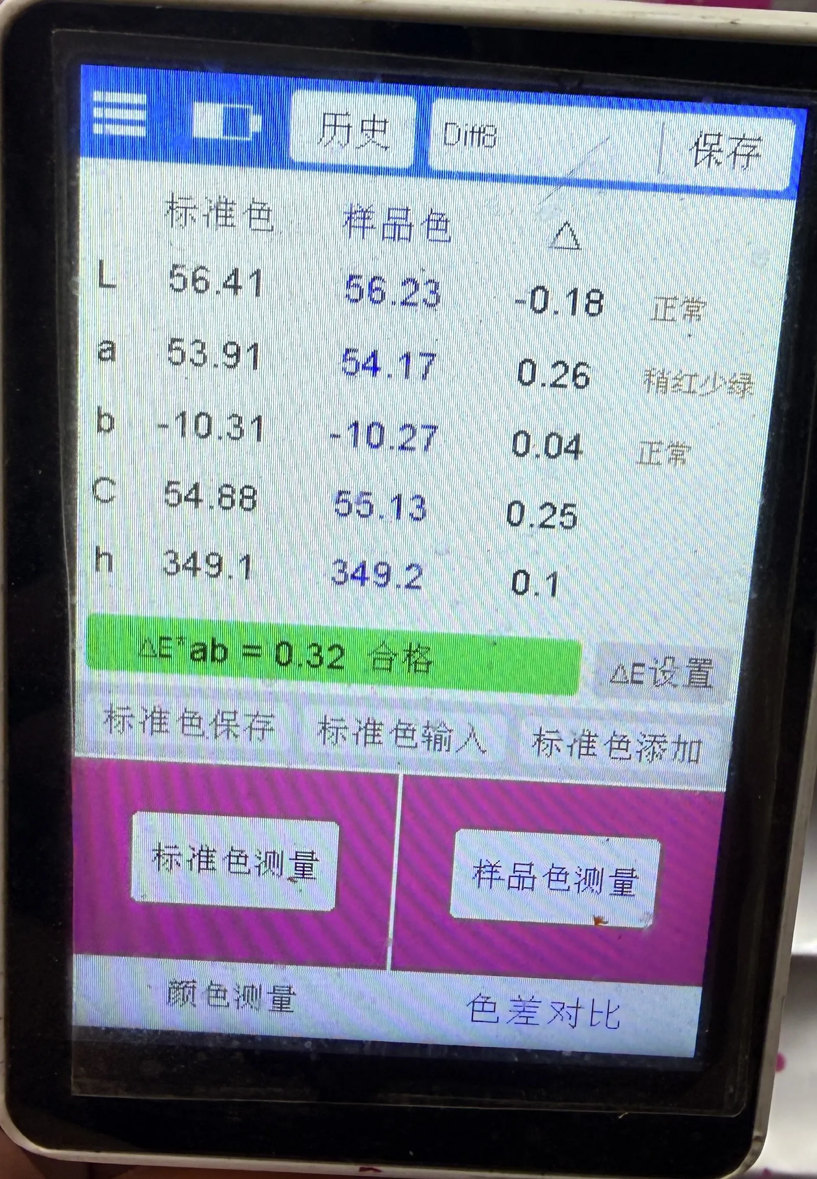
The result:
Delta E < 0.3 — a near-perfect match within industry tolerance.
The client paused. The tone shifted.
A Practical, Win-Win Proposal
We proposed a two-part solution:
1. Transition Plan
- Offer the current batch at 70% price
- Help the client avoid supply chain disruption
2. Optimization Plan
- Use Pantone cards as the only color standard
- Send material-based physical samples before production
- Align expectations across all parties
This combination of data + accountability + flexibility changed the conversation.
The client acknowledged the technical complexity and admitted unfamiliarity with gravure printing limitations.
Tension turned into cooperation.
4. The Execution: A Two-Week Sprint to Recovery
The real test began after the meeting.
We restarted production with full optimization:
- New gravure cylinders (printing plates)
- Custom ink formulation
- Continuous color calibration
Most importantly, we introduced real-time transparency:
- Scheduled live video sessions during printing
- Allowed the client to review and adjust colors on the spot
This level of openness is part of our Индивидуальные решения для гибкой упаковки approach.
Two weeks later, the second batch arrived in Mexico.
Then came the email we were waiting for:
“Approved.”
The Result: Trust Beyond the Crisis
The crisis didn’t just resolve—it transformed the relationship.
- Tom successfully retained his contract
- The end client gained confidence in our process
- We strengthened our role as a reliable manufacturing partner
Later, Tom told us:
“That color issue was painful—but it made me trust you even more.
Not everyone handles problems with that level of professionalism and transparency.”
The Takeaway: Color Fades, Trust Lasts
In the world of flexible packaging, color is never just color.
Every project involves variables:
- Materials
- Printing methods
- Environmental perception
Even the most precise systems can encounter unexpected challenges.
But what truly defines a manufacturer is not avoiding problems—it’s how they respond.
At Zhongjia Packaging, we believe:
Professionalism + Transparency = Long-Term Trust
Как преданный Spout Pouch Manufacturer, Упаковка Zhongjia remain committed to delivering not only high-quality products but also clear communication, technical expertise, and dependable solutions.
Because in the end, what lasts longer than color is trust.
